Popular Science » The 2020 Redesign
The goal for our redesign was not to dismantle our pre-existing structure but to keep the things we love about Popular Science and give them a refresh. Because each issue is made to stay relevant for years, I chose typefaces and design trends that felt new but timeless.

Typeface Forward
The redesign began with Big Q’s, an essay portion that focuses on common questions having to do with the theme of our issue. Starting with our most type-heavy section allowed me to test out new fonts and see how they worked together to compensate for a lack of imagery.

Marrying Type and Image
For our “Goods” section, photo heavy with minimal type, simplifying elements was key. I wanted the design to be versatile and dynamic, able to move around the layout based on the image it accompanies. We also decided, based on the coloring of Big Q’s, that each issue would have a specific color that you see throughout, coloring small elements such as arrows and numbers.
Re-charting Charted
We wanted to keep “Charted” our infographic centric front of book section, but reshape it. I wanted to keep the way the logo moved on each page and was often incorporated into the chart/illustration, but make it something new for Popsci. “Charted” immediately brought images of maps and compasses to my mind, and so I fashioned the logo into a more simplified version of a compass rose. You can see the compass rose logo resting prominently in the Charted logo box, and incorporated into the illustrations of the charts below.

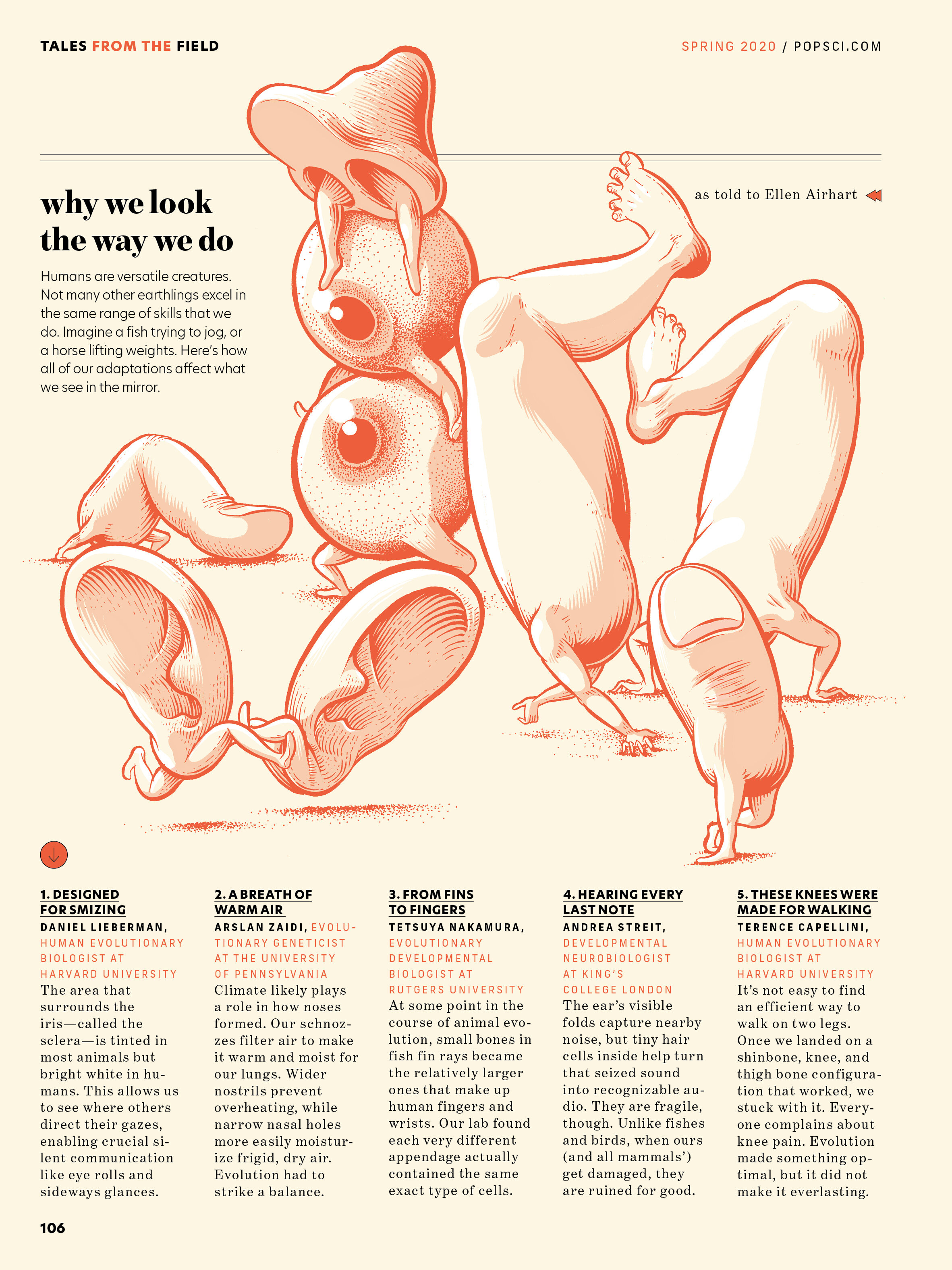
Field Notes
A long-loved section in Popular Science, Tales from the Field allows experts in various areas of scientific research to tell out-there stories about their profession. Our team loves the conceptual, out-there style illustrations that have always played a huge part, and felt this section just needed a style refresh. Inspired by old Boy Scout manuals and National Parks guides, I wanted the new look to feel like a simplified adventure journal that readers got to take a sneak peek at.